“Cities, architecture and culture” – Venice architecture Bienalle 2007

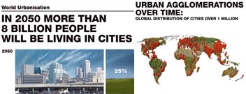
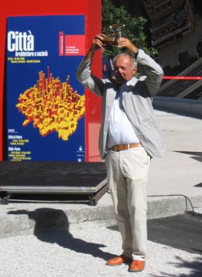
Cities, architecture and culture is the theme of this years architecture bienalle (supposedly the largest and most important architectural event / exhibition in the architectural world) in Venice, Italy
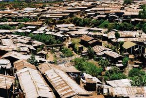
I would like people to view a short 4 minute film from Kibera, which is a part of Nairobi city in the African Country of Kenya, to see what is the reality that we are dealing with.

Kibera is one of the largest slum areas of Africa with over 1 million people living in an area with only 5 toilets, which you have to pay to use with the result that people use “flying toilets” whereby people do their business in a bag and throw it in the street or in the pile of already thrown bags, you can imagine the level of live sewage this leads to. Streams of live sewage flow through the streets. there are only 3 schools in the area and huge levels of disease and crime. Watch the film and see what you think.

I make reference to this example as on arriving to the Burrida social centre 2 days ago, where I am now living here in Genova, I met Pastor Nick Macharia, the program director of Pepkag (prison extension programme of Kenya association of Gaoled [underpriveleged people in society] ) and we had a discussion about the situation in the slums of Kibera which can be heard here : Kibera slums, Tenderfeet and a vision of hope for Kenya and Africa
I introduce the theme of this years Bienalle in this way as I have just returned after some days spent in Venice, ironically enough I ended up living in the French Pavillion for that time. I have a few observations on the Bienalle having seen the set up there;
(As there still seems to be no adaquate means of experiencing the Bienalle or accessing the information on show I will try to update people here as time allows.)
1 – Overall, there is a poor attendance at the Bienalle, it seems it is mostly architects that attend. Perhaps this is due to the entry fee of perhaps it is due to a lack of interest in architecture and this years theme from the wider community? Perhaps an open day or week might make it more widely recieved.
2 – This theme “cities, architecture and culture” is a truly massive, complex and important topic or question to raise, personally i feel it is the topic we, as a species, have to fully address so we can live in the future in the most just and sustainable state. But who today is taking part in this discussion, who has been invited to participate in the discussion? it seems it is still the professionals who discuss and make the decisions, is this fair? should all people not be able to contribute to this discussion? if so how could this happen?
A possible solution might be to attempt something similar to the widening the discussion project for this years World Social Forum in Kenya.
Each of the choosen 10 cities highlights 4 projects to demonstrate what they are doing for positive change.
3 – A lot of valuable research has been carried out for this years exhibition, 10 global cities were looked at in detail; growth rates, ethnic makeup, movement trends, health and welbeing, etc…. At present this information can only be seen on the walls of the exhibiton or in the exhibition catalogue, which is a 2 volume series of @ 300 pages and costs a whopping 60 Euros. This information should be made freely accessible to all, be that simply on the website (which now has no links to this information) or printed in cheap newspaper form for those attending the conference. I am unaware of what is planned for after the exhibition ends.
4 – There is a Blog up and running at present www.venicesuperblog.net for people to add their views, videos, interviews, photos. This is a healthy move but it could be more open.
I’ll leave you with a post from it, The Giardini: the micro tour, and a notion about what is the point of this architecture stuff: self praise or a true wish to build a better world followed by practical examples of that wish turned into action

Apology and disclaimer: if some reviews seem cursory and superficial, it is because they are.
France
Some good looking people live in an atomised house, its elements spread about the pavilion, including a sauna on the roof. Not 100% original but put a smile on the face. ****
Germany
Decided like the French to expand onto the roof , in this case to make a point about adapting cities. One hates to confirm national stereotypes but the German roof has more efficient circulation than the French, and less joie de vivre. ***
Britain
Steel town of Sheffield gets the Calvino treatment. Nice try but a little too friendly. Music at the opening by the electrifying Long Blondes. ***
Canada
Exercise bicycles powering movies. Something to do with the environment. I’m afraid I just didn’t get this. **
South Korea
Tongue-in-cheek celebration of residential real estate. ***1/2
Japan
Fujimori and friends show how to save the world by building in charcoal, thatch etc. Appealing, and a nicely reflective atmosphere in the din of the Biennale, but perhaps a little too cute. Hello Kitty goes eco. And conservative. ****
Russia
Went into ground floor. Saw a lugubrious film about a project. Went no further. My apologies. Unfair to rate.
Venezuela
Most resonant and inspiring statement in the Giardini. “Understand this: our cities are born from a different society. We cannot imitate them. Ours (the third world) is different. It has different roots and another fate. Your recipes, which are the recipes of entertainment, are useless to us. Let us mend our errors our way, and the consequences your outrage. Do not judge us without understanding us. In the future we may even be able to teach you something.” Aerial photos of Barrios (see also Sara Muzio’s film in the Biennale). Venice is crackers about Caracas this year. ***1/2
Denmark
Projects by young Danes for developing China in a sustainable way. Serious. Are the Chinese listening? ****
Nordic pavilion
Svere Fehn’s pavilion, an exercise in sophisticated tree-hugging, on its own makes it worth coming here every two years. The exhibit was about very northern and cold cities and looked thorough and thoughtful, but it was one of those that should have been a book. **1/2
Switzerland
Dominican Republic + history of slavery and sugar planting + Bernard Tschumi = “elliptical” city. I’m sorry, I didn’t get it. **
Czech Republic
Work of students hung on scaffolding. Not sure what the message was. *1/2
Australia
Responses to Australian urban/suburban conditions. Some projects nice enough. Not gripping. **
Spain
Women speaking about cities out of pristine glass boxes: Almodovar meets Clinique display. The technology made it hard to find out what they were all saying. ***
Belgium
The Beige Badge of Boringness or, Sing if You’re Glad to be Ordinary: a celebration of Belgian neutrality. The whole country laid out in a single photograph, which is impressive, and intriguing labyrinthine installation, plus a film of wilful tedium: glass office blocks with nothing happening etc. ***1/2
Netherlands
Dutch visions of future cities since early last century. Nice to have a little of the perspective of history, but I didn’t understand the many timber slats of the installation. ***1/2
Finland
Some fairly interesting residential projects, straightforwardly presented. Not much to do with the Biennale theme, and oblivious to the prevailing mood of looking beyond the architectural object.
**
Hungary
Colourful installations resembling artificial flora that sing when touched. Apparently something to do with China. But very, very baffling, and a little kitsch, like a weird variant on the Venetian mask/glass/paper shop.
**1/2
Israel
The biennale’s most controversial pavilion, probably inadvertently. A study of Israeli memorial architecture which has upset some by failing to acknowledge that others suffer too, including Palestinians (see Charles Jencks Superblog interview). Complexity, they say, is denied. The critics quite possibly have a point, but these superficial and cursory reviews are not the place to rush to judgement on issue such as this, so no rating.
Brazil
Another variation on the dominant Biennale idea of showing cities as case studies, using the formula of data + films of City Life = architecture. In this case Sao Paulo. **1/2
Austria
Takes on the city by Kiesler, Hollein and Gregor Eichinger. As with the Dutch Pavilion, it’s nice to go into the past, but a bit terse and short on explanation. ***1/2
Serbia
A big nearly empty space with quite a lot of noise and some average projects. It might have been easier to fill this room when it represented the whole of Yugoslavia. *
Egypt
Doors locked. The only permanent pavilion representing either Africa or the Arab world was unable, for whatever reason, to exhibit.
Poland
A film of Warsaw in which an imaginary elevated glass tube takes pedestrians and cyclists through the city in hygienic serenity. Would this actually be nice? Or a bit chilling?
***1/2
Romania
Make your own city using large dice-like objects. ***
Greece
The Aegean Islands as a case study in places made by tourism, seasonal fluctuation and the movement
of people. Thought provoking, but too many words: another one that is too book-like. ***
MAXXI (not a country)
Rome’s new Hadid-designed museum of contemporary art combines photos of its construction with other Roman projects under construction. Nicely presented. ***
USA
Katrina. How shocking it was. Some suggestions (how plausible?) about what to do about it. Question: if you were being rehoused after a flood, would you want your home to be a commentary on the flood, or just a home?
***
Italian Pavilion
The best part of the Biennale, where different institutions pick up the Cities theme and play with it. Highlights include:
Domus magazine’s study of Pyongyang, North Korea, culminating in proposals for the 1000-foot high, pyramidal, never-completed Ryugyong hotel, the concrete shell of which is the city’s most conspicuous and embarrassing landmark. Brilliant, witty and serious. Real research and real discovery for the viewer, which is not often to be had in the Biennale. Teeters on the edge of being too ironic and stylish in relation to the extremely grim subject of North Korea, but stays on the right side. Communicates, through projected images, in 3-D and with few words, which is what you want in the Biennale. *****
Ireland
A study of the Super Rural, or how to create urbanism in the countryside. ***1/2
Royal College of Art
Humming, gaudy, multimedia study of London that is an antidote to the statistics in the Arsenale. The city as lived and made, with the capacity to exhilarate and terrify. ****1/2 and ***** for the wonderful video Driving with the Joneses.
C-Photo
Super-charged photography glitteringly displayed. Close at times to straying into catastrophe chic. ****
OMA/AMO on the Gulf States
Rem’s two offspring do their now familiar operation of treating spectacular but derided phenomena with respect. Facts, especially perverse ones, are assembled. Deadpan provocations are made. Bien pensant assumptions are challenged. Your perception of the world is shifted. Does Rem like this stuff or not? As always, he won’t say. ****
posted by duncan
Tue, 26 Sep 2006 11:44:00 GMT

